Why your trip pages aren't converting (and how to fix them)
You’re getting traffic to your trip pages. Google Analytics says people are landing on your half-day rafting page, your guided fishing trip, your sunset kayak tour. But they’re not booking. They look around for 30 seconds and leave.
The average conversion rate for travel and activity websites hovers around 1-2%. That means 98 out of 100 visitors leave without booking. Some of that is normal browsing behavior. But a lot of it is fixable. Trip page conversion optimization isn’t about redesigning your whole website. It’s about removing the specific friction points that stop a ready-to-book visitor from following through.
Here are the mistakes we see most often on outfitter trip pages, and exactly how to fix each one.
Your pricing is hidden or missing
This is the single biggest conversion killer on outdoor recreation websites. A visitor lands on your trip page, reads the description, gets excited, and then can’t find a price. The page says “Call for pricing” or “Starting at…” with no actual number, or it buries the cost in a PDF somewhere.
People don’t call anymore. They open the next tab and find an outfitter who shows the price upfront.
Put your pricing on the trip page, visible without scrolling on desktop. If you have different rates for adults, kids, and groups, show them all. If your pricing varies by season or day of the week, show the range and explain it. “$59/person weekdays, $69/person weekends, kids 12 and under $49” takes one line and answers the question that 80% of your visitors have.
Your website should function as a booking engine, not a brochure that requires a phone call to get basic information.
Your call to action is buried
Scroll through your trip page on your phone. How far down do you have to go before you see a “Book Now” button? If the answer is more than one screen, you’re losing people.
Your primary call to action should appear above the fold, visible without any scrolling. It should also repeat at the bottom of the page and at least once in the middle for longer pages. The button text should be specific: “Book this trip” or “Check availability” beats a generic “Learn more” or “Contact us.”
Color matters too. Your booking button should be the most visually prominent element on the page. If it blends into your color scheme, it’s invisible. A contrasting color that stands out from the rest of the page isn’t ugly. It’s effective.
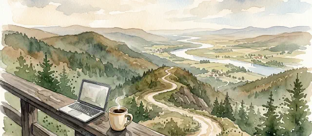
You’re using stock photos
A customer who’s about to spend $150 on a rafting trip wants to see what that trip actually looks like. Not a stock photo of a generic raft on a generic river. Your river. Your guides. Your guests.
Take photos on your trips. You’re already out there. A guide with a waterproof phone case can capture two or three real photos per trip that are infinitely more convincing than any image you can buy. Show people at the put-in looking excited. Show them mid-rapid. Show the scenery they’ll actually see.
If you have professional trip photos from a photographer, even better. Put the best three or four at the top of the page. People process images before they read text, so your photos set the emotional tone before a single word registers.
A page full of real trip photos converts. A page with one stock hero image and a wall of text doesn’t.
Your description reads like a brochure
“Experience the thrill of world-class whitewater on the scenic Upper Ocoee River. Our professional guides ensure a safe and memorable adventure for the whole family.”
That description could be on any outfitter’s website in the country. It says nothing specific. It doesn’t tell the visitor what the trip actually involves, how long it takes, what the rapids are like, or what they’ll experience hour by hour.
Rewrite your trip descriptions to sound like a real person talking about a real trip. Include specifics: how many miles of river, what class rapids, how long you’re on the water, what the highlight rapid is called, what the calm sections are like. Answer the question “What will I actually do for four hours?”
Before: “An unforgettable half-day adventure on the Ocoee River suitable for all skill levels.”
After: “Four hours on the Upper Ocoee with five Class III-IV rapids, starting with a warm-up stretch and building to Grumpy’s, the drop everyone remembers. We provide all gear including wetsuits when the water’s cold. Most groups are laughing by the second rapid.”
The second version gives a potential customer something to picture. That’s what converts.
There’s no social proof on the page
Your Google reviews might be excellent. Your TripAdvisor rating might be 4.9. But if none of that shows up on your actual trip page, visitors don’t see it when it matters most.
Pull two or three of your best reviews and put them directly on the trip page, near the booking button. Choose reviews that mention the specific trip, not just your company in general. A review that says “The half-day Upper Ocoee trip was the highlight of our vacation” does more on your rafting page than a generic “Great company, friendly staff.”
Include your star rating and total review count somewhere visible. “4.8 stars from 312 reviews” is a trust signal that takes up one line and does heavy lifting. If your booking platform supports embedded review widgets, use them.
It takes too many clicks to book
Count the steps from “I want to book this trip” to “My credit card has been charged.” If it’s more than three or four clicks, you’re leaking customers at every step.
The ideal flow: visitor clicks “Book Now,” selects a date, chooses their party size, and pays. That’s it. Every additional page, every unnecessary form field, every “create an account” prompt is a place where people abandon the process.
If your booking widget loads slowly, that counts as friction too. A visitor who clicks “Book Now” and waits four seconds for a calendar to load is already reaching for the back button. Test your booking flow on your phone over a cell connection, not on your office Wi-Fi. That’s how your customers experience it, often from a campground or a hotel with mediocre signal.
Most modern booking platforms (FareHarbor, Peek, Xola) are designed for fast, minimal-click checkout. If yours isn’t performing, the issue is usually configuration, not the platform itself.
Fix the page you already have
You don’t need a new website. You need to fix the trip page that’s already getting traffic. Start with whichever problem is easiest to address (usually pricing visibility or CTA placement) and make the changes that drive bookings, not just clicks.
Then watch your numbers. If your trip page gets 1,000 visitors a month and you move your conversion rate from 1% to 2%, that’s 10 additional bookings per month from traffic you’re already getting. At $75 a head, that’s $750/month you were leaving on the table.
The traffic problem and the conversion problem are different problems. Most outfitters spend all their energy trying to get more visitors when the faster win is converting more of the visitors they already have. Fix the page first. Then drive more traffic to it.