Why most outdoor business websites look the same (and how to stand out)
Open ten rafting company websites in a row. You’ll see the same drone shot of a river canyon. The same “Experience the adventure of a lifetime” headline. The same wall of text about passion and commitment. A booking button hidden somewhere on the third scroll. Swap the logos and you couldn’t tell which company is which.
Outdoor business website differentiation is rare because most operators build their sites the same way: pick a template, drop in a stock photo, write something that sounds like marketing, and call it done. The result is a website that looks professional enough but says nothing specific, shows nothing real, and gives a potential customer zero reason to choose you over the next result on Google.
Here’s why that happens and what to do instead.
The template trap
Most outdoor business websites start from the same handful of WordPress or Squarespace themes. Adventure theme. Exploration theme. Big hero image, parallax scrolling, a strip of icons for your activities. These templates look clean and they’re easy to set up. The problem is that three hundred other outfitters started from the same template.
When everyone uses the same layout, the only things that differentiate you are your photos, your words, and your booking flow. And if those are generic too, you’ve got nothing.
The template itself isn’t the enemy. Plenty of great outdoor business websites run on standard themes. The problem is filling a template with default-feeling content. A good structure with bad content is still a bad website.
Stock photos are the biggest offender
You know the images. A perfectly lit raft crashing through a wave with everyone smiling and no one’s sunscreen running. A fly fisher silhouetted against a sunset on a river that could be anywhere. A family of four in matching life jackets that clearly came from a stock photography set.
Visitors can tell. Maybe not consciously, but they register the disconnect. The photo doesn’t look like your operation because it isn’t your operation. It says “we sell outdoor trips” without saying anything about your outdoor trips.
Real photos from your actual trips do something stock photos can’t: they answer the question “What will this actually look like when I show up?” A slightly imperfect photo of real guests on your actual river is worth more than a magazine-quality shot of someone else’s.
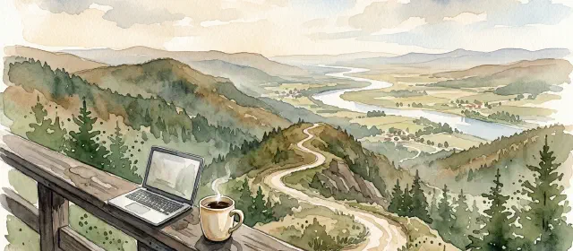
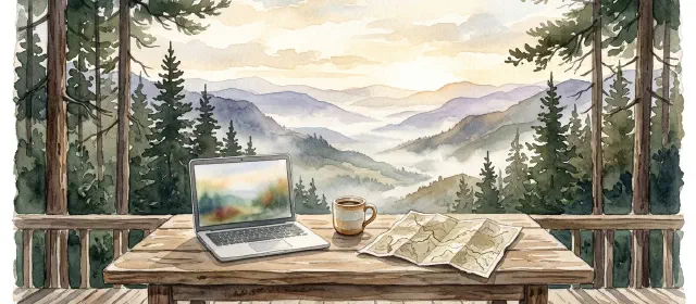
You already have these photos. Your guides take them. Your guests take them. The phone in your pocket has hundreds from last season. Use them. A homepage hero image of your team at your put-in point on a sunny July morning tells a visitor more in one second than three paragraphs of marketing copy.
“Experience the adventure of a lifetime”
That phrase, or some version of it, appears on an alarming number of outdoor business websites. Along with “creating memories,” “unforgettable experiences,” and “passionate about the outdoors.” These phrases feel safe because everyone uses them. They’re also completely empty.
A visitor reading “Experience the adventure of a lifetime” learns nothing. Not what you offer, not where you operate, not what makes your trips different, not why they should book with you instead of the outfitter next door who also promises adventures of a lifetime.
Specific copy that sounds like you talking about your trips does the work vague copy can’t. Compare these two trip descriptions:
“Our experienced guides will take you on an unforgettable journey through breathtaking scenery. Whether you’re a beginner or an expert, we have something for everyone.”
Versus:
“The full-day float covers twelve miles of the upper Madison from Varney Bridge to Ennis. June through September, you’ll fish PMD and caddis hatches in the morning and switch to hoppers after lunch. Your guide rigs the rods and rows the boat. You bring sunscreen.”
The first could describe any outfitter anywhere. The second could only describe one operation on one river. That specificity builds trust, answers real questions, and gives Google something to rank you for. “Best fly fishing Madison River” is a real search query. “Unforgettable journey breathtaking scenery” is not.
The buried booking button
A visitor lands on your homepage. They’re interested. They want to see trips and pricing. Where do they click?
On too many outdoor websites, the answer is unclear. The booking button is a small text link in the navigation. Or it says “Contact Us” instead of “Book a Trip.” Or pricing isn’t listed anywhere, replaced by “Call for rates,” which in practice means “leave this site and check a competitor who shows prices.”
Your website is a booking engine, not a brochure. The booking path should be obvious from every page. A visible button in the header. Pricing on every trip page. A booking link at the bottom of every blog post. Someone should never have to wonder how to give you money.
Over half of outdoor recreation searches happen on mobile. A person sitting in a vacation rental scrolling their phone will not hunt through your navigation to find a booking form. If the path isn’t obvious within five seconds, they’re back on Google tapping the next result.
How to actually stand out
The fix isn’t a redesign. It’s replacing generic content with specific content on the site you already have.
Replace stock photos with real ones. Homepage hero, trip pages, about page, gallery. Every image should be from your operation. If the photo quality isn’t perfect, that’s fine. A phone photo of a real guest catching a real fish on your river converts better than a stock image of a model with a flyrod.
Rewrite your copy to name specifics. Rivers, trails, put-in points, towns, gear, hatches, rapids. Run every sentence through this test: “Could a competitor copy this word for word?” If yes, it’s too generic. Rewrite until the answer is no.
Put pricing on your trip pages. Visitors who can see pricing convert at a dramatically higher rate than visitors who have to call or email for a quote. If your pricing varies by season or group size, show the range. “$125 per person / $100 for groups of 6+” is useful. “Contact us for pricing” is a barrier.
Make the booking path unmissable. A button in your header that says “Book a Trip” or “Check Availability.” A booking CTA at the bottom of every trip page and every blog post. The core pages every outdoor website needs should all funnel toward a booking action.
Let your voice come through. You’re not a hotel chain. You don’t need to sound like one. If you’re a two-person guide operation on the Deschutes, your website should sound like two people who love fishing the Deschutes, not a marketing committee.
Your website is your first impression
Most visitors will never call you, never walk into your shop, never meet your guides before they decide whether to book. Your website is the only impression they get. And if it looks and reads like every other outdoor business website, you’re asking them to choose you for no particular reason.
The outfitters who book consistently from organic traffic are the ones whose sites feel specific, personal, and easy to use. Real photos. Real voice. Real pricing. Clear path to book. Not a flashier design or a bigger ad budget. Just a website that actually represents who you are and what you do.
You’re not the same as every other outfitter. Stop letting your website say you are.