What to put on a landing page that actually books trips
Most trip pages on outfitter websites look the same. A big pretty photo, a paragraph about “the adventure of a lifetime,” a price buried somewhere near the bottom, and a Book Now button that somehow feels like an afterthought. The landing page outdoor recreation bookings problem isn’t that operators don’t have pages. It’s that those pages aren’t built to convert.
A good trip landing page answers every question a potential customer has, in the order they’re going to ask them, without making them scroll around looking for basic information. Here’s what that looks like from top to bottom.
The headline needs to say what the trip is
This sounds obvious. It’s not, judging by most outfitter websites.
“The Ultimate Adventure Awaits” tells the visitor nothing. “Half-Day Whitewater Rafting on the Arkansas River” tells them exactly what they’re looking at. Which trip, how long, where.
Your headline is doing two jobs: confirming for the visitor that they’re on the right page, and telling Google what this page is about. “Guided Fly Fishing on the Upper Madison” does both. “Experience Nature Like Never Before” does neither.
If you offer multiple versions of a trip (half day, full day, overnight), each one should have its own page with its own specific headline. Don’t make visitors figure out which option applies to them from a single page with too much going on.
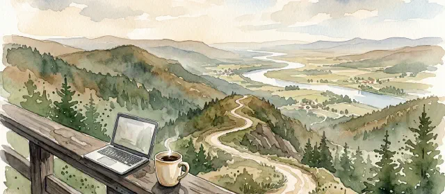
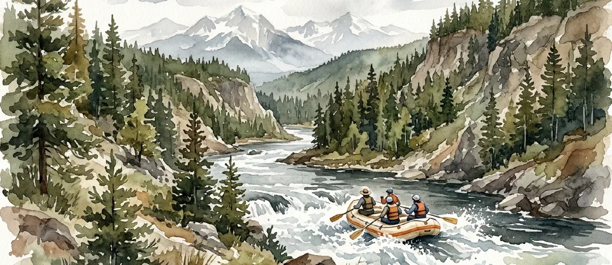
The hero photo should show the actual trip
Use a real photo from the actual trip on the actual river or trail. Not a stock photo. Not a photo from a different trip you offer. If the page is about your Browns Canyon half-day, show Browns Canyon.
People in the photo helps. Action helps more. A raft full of people hitting a wave converts better than an empty river at sunrise. The sunrise is beautiful, but the wave answers the question “what will this feel like?”
One strong hero image beats a gallery of 20 mediocre ones at the top of the page. Save additional photos for lower on the page where they support the details.
Put the essential details above the scroll
Before anyone scrolls, they should be able to see: what the trip is, how long it takes, and what it costs. These are the three things every visitor wants to know immediately. If they have to hunt for any of them, you’ve already lost people.
Duration and distance: “8 miles, approximately 3.5 hours on the water.” Not “half-day,” which is vague. Tell them what half-day actually means.
Difficulty: “Class III rapids, no experience required” or “Class IV-V, prior rafting experience recommended.” This self-selects visitors and reduces calls from people who were never going to book.
Price: put it right there. Don’t hide it behind a “contact us for pricing” link. If your price is competitive, showing it builds confidence. If your price is premium, the rest of the page needs to justify it. Either way, hiding it just makes people leave and check your competitor’s site where the price is visible.
Season and availability: “Runs May through September” and a link or widget to check available dates. The fewer clicks between “I’m interested” and “I can see when it’s available,” the more bookings you get.
Write the trip description like a guide, not a brochure
This is where most pages fall apart. The description reads like it was written by a marketing committee instead of someone who’s actually been on the trip.
We covered how to write about your trips naturally in detail, but the short version: describe what actually happens. Where you put in, what the first stretch is like, where the big rapids are, where you stop for lunch, what the scenery looks like at the halfway point. Walk the reader through the trip chronologically.
“You’ll put in at Hecla Junction and spend the first mile getting comfortable with your paddle team. The river is mellow here, Class II at most. Then you hit Pinball, the first real rapid, and things pick up from there.” That’s a trip description. “Experience thrilling whitewater adventure in one of Colorado’s most scenic canyons” is a greeting card.
Social proof goes right before the CTA
By this point in the page, the visitor knows what the trip is, what it costs, and what to expect. Now they need to hear from someone who isn’t you.
Pull three to five reviews from Google or TripAdvisor. Pick reviews that mention specific details about the trip, not just “great time!” A review that says “Our guide Jake was hilarious and knew exactly where to position the boat for the best waves” does more work than five generic five-star reviews.
If you have notable numbers, include them. “4.9 stars across 340 reviews on Google.” That’s all you need. Don’t overcomplicate it.
Photos from guests work here too. If people have tagged you on Instagram or sent you photos, ask if you can use a few on the page. Guest photos feel more authentic than your professional shots, and they show real people having a real time on the trip.
The CTA should be impossible to miss
Your call to action should be a button that says what happens when you click it. “Book This Trip” or “Check Availability” are clear. “Learn More” is not a CTA, it’s a dead end.
Put the primary CTA in at least two places: once near the top (after the essential details) and once at the bottom (after the reviews). Some operators add a sticky button that stays visible while scrolling, and when done well, that works too.
Include a phone number next to the button. Some people, especially older customers and groups booking larger parties, want to talk to someone. Make that easy.
Add an FAQ section at the bottom
A short FAQ section catches the visitors who are almost ready to book but have one nagging question. What should I wear? Is there a minimum age? What if it rains? Do you provide gear?
You already know these questions because customers ask them on every single trip. Put the answers on the page. It reduces pre-booking phone calls (freeing up your time) and removes the last friction between “I want to do this” and “I just booked it.”
This section also helps with SEO. FAQ content often matches the long-tail queries people search, and if you add FAQ schema markup, these questions can show up directly in search results.
Stop treating trip pages as afterthoughts
Your trip landing page is where the decision happens. It’s where months of SEO work, ad spend, word-of-mouth referrals, and social media posts all lead. If that page isn’t built to convert, everything upstream is wasted effort.
If your trip pages aren’t converting the way you think they should, start with these basics before you spend money driving more traffic to a page that leaks visitors. And if your whole website feels more like a digital brochure than a booking tool, the trip page is the best place to start fixing that.
Get the fundamentals right on one trip page first. Then replicate it across the rest.